Apolis
Visual Brand Identity
Art Direction • Branding • Copywriting • Product Development • Prepress
Overview
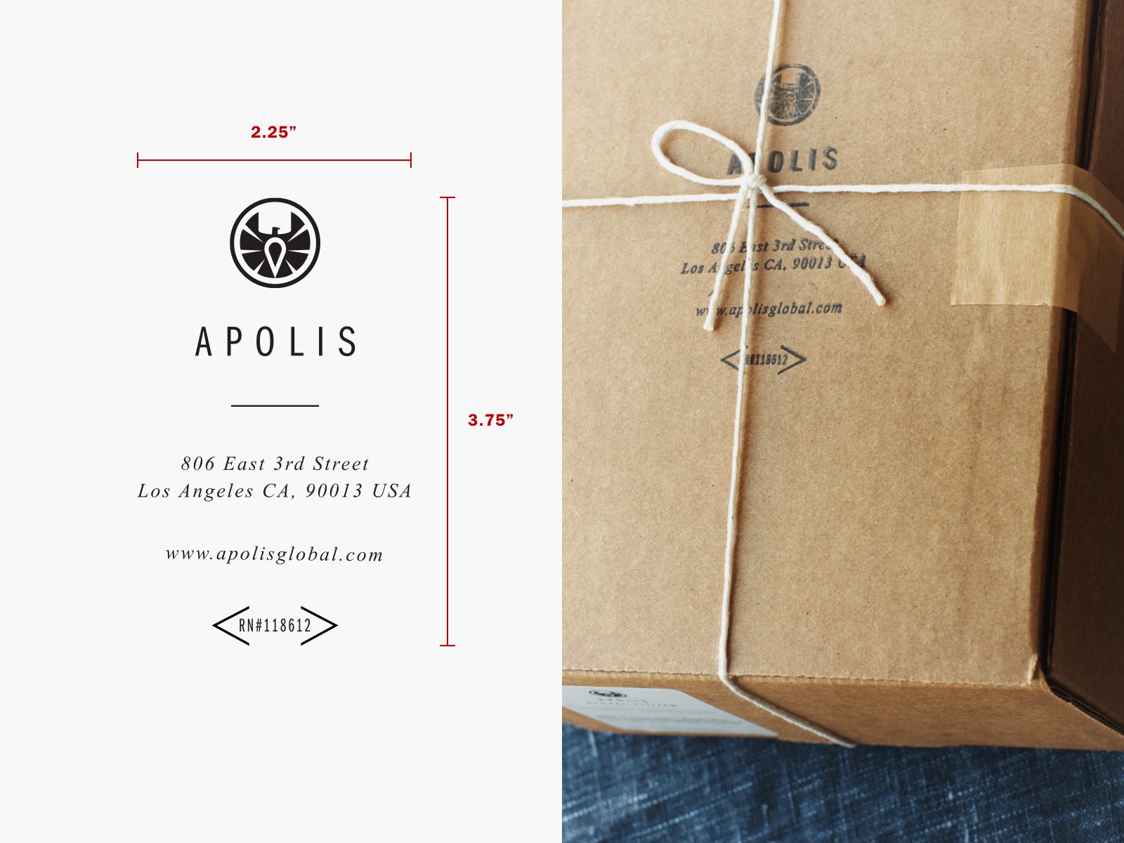
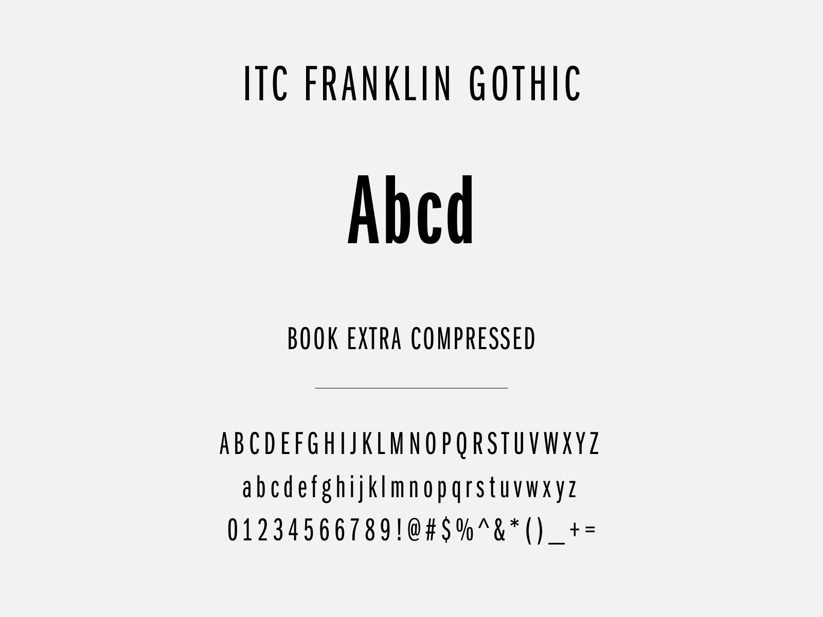
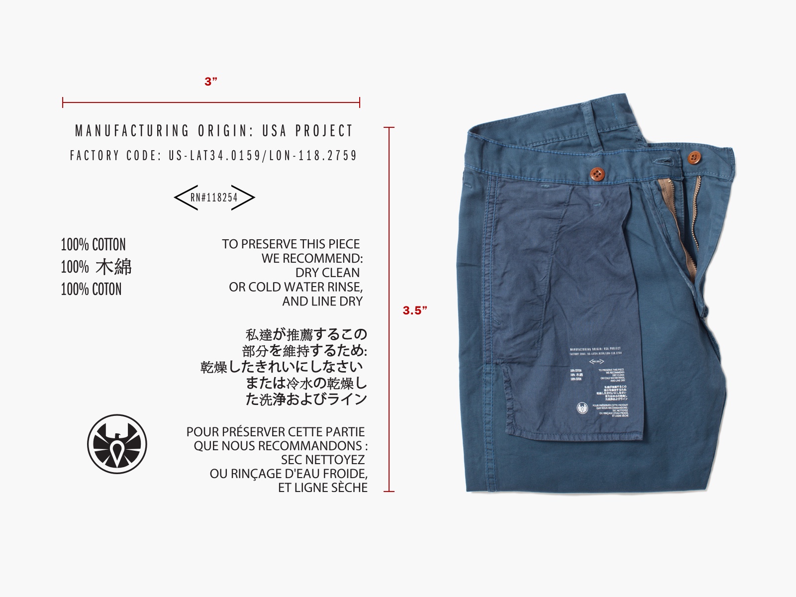
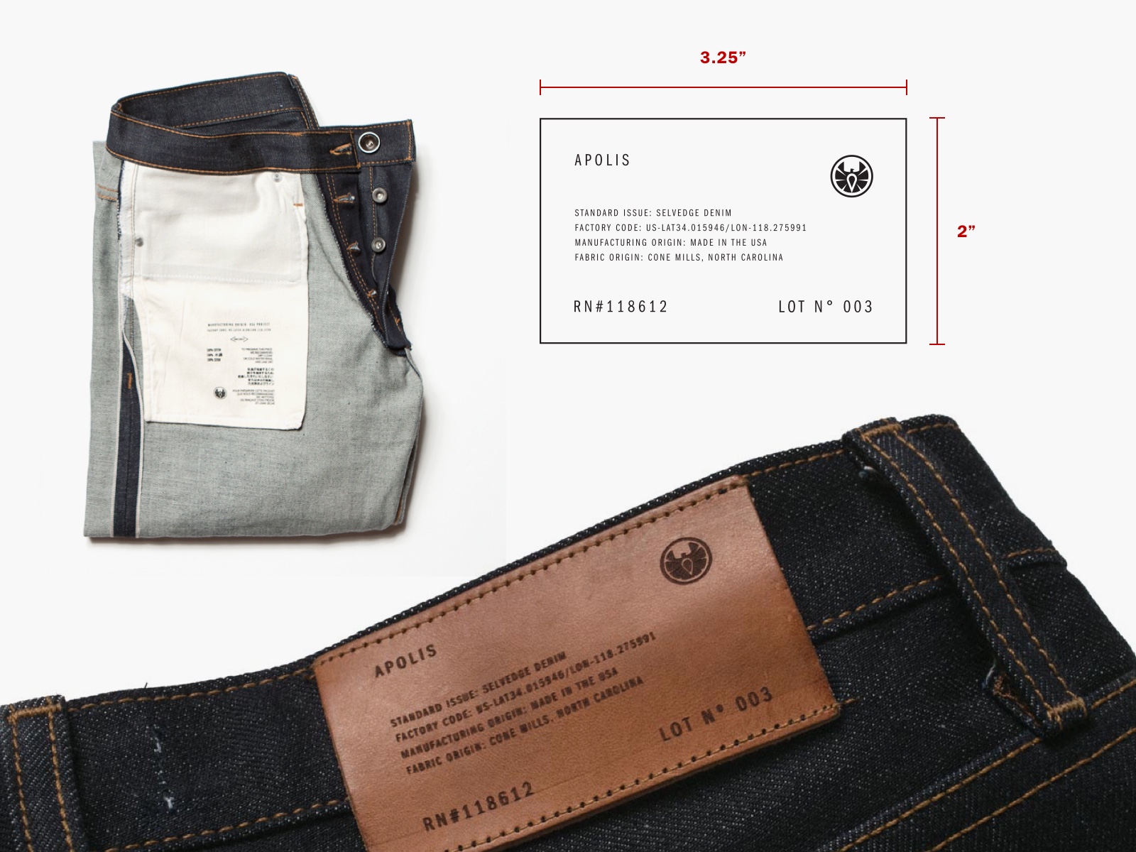
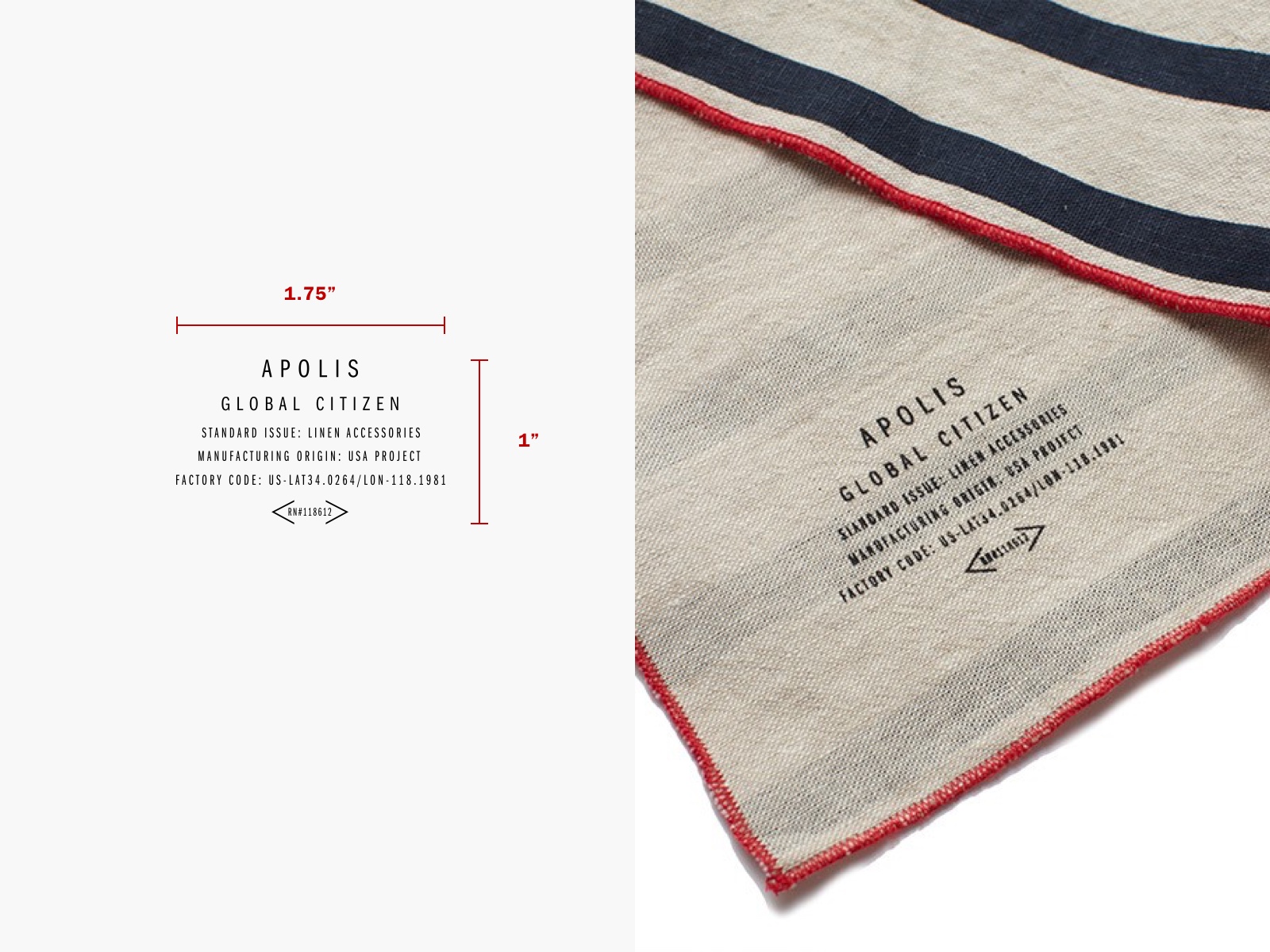
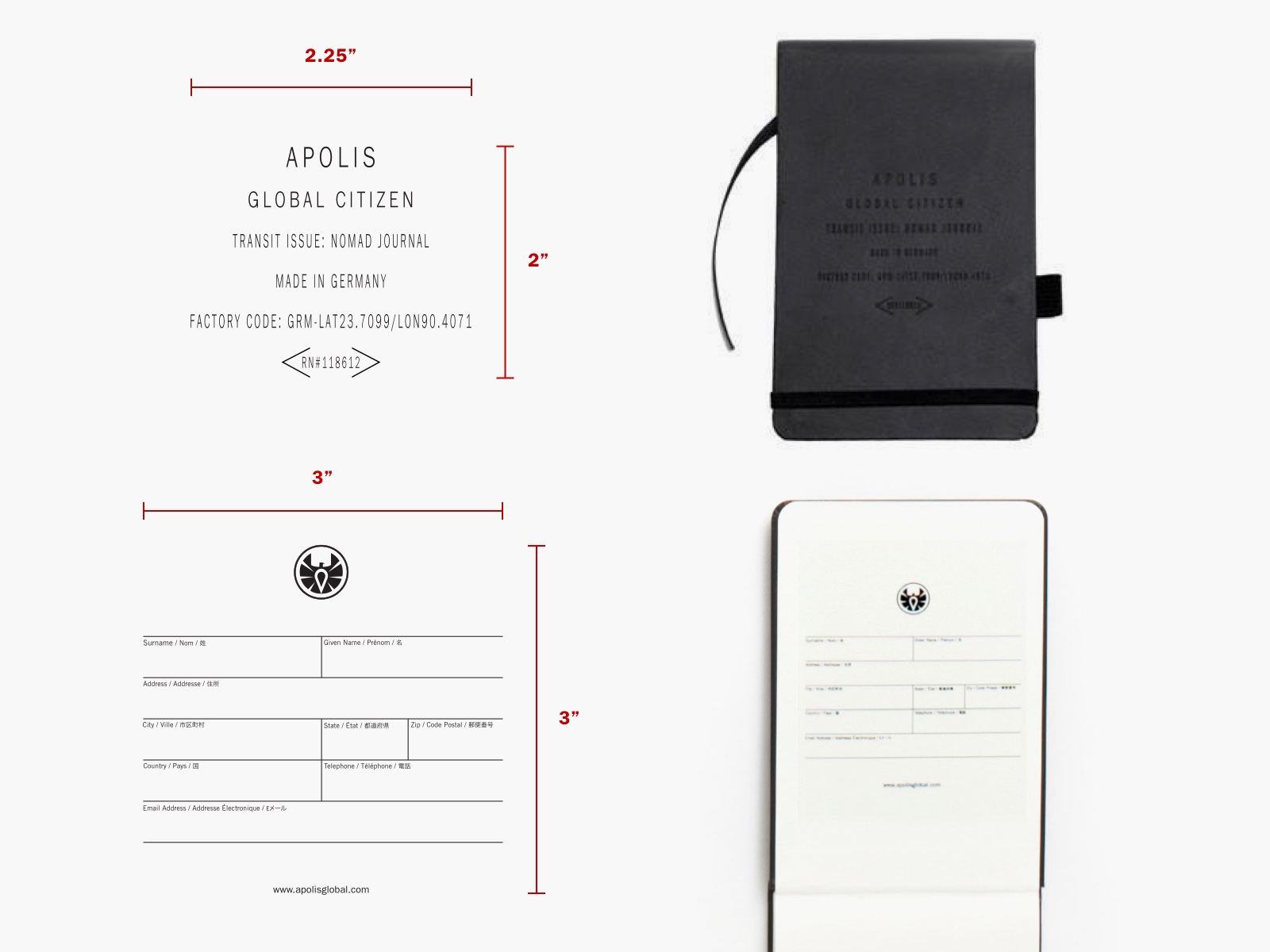
The Apolis visual identity is heavily marked by the preferred type family of ITC Franklin Gothic, set with generous tracking in the Book Extra Compressed style/weight. The result is a military-inspired utilitarian look which yields an attractive simplicity when paired with the rich fabric textures collection garments.
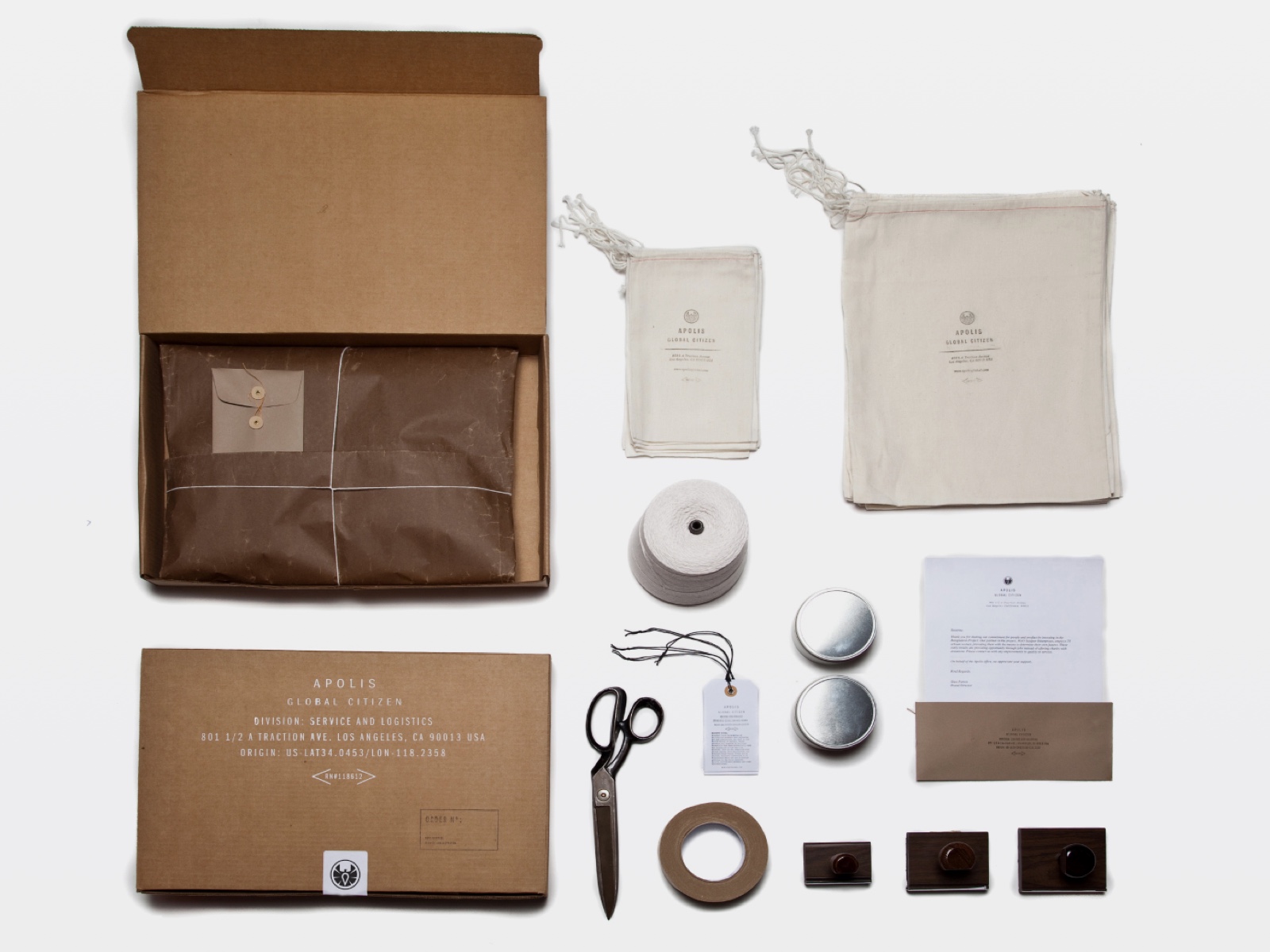
In taking cues from WWII-era military tailors, the brand manufacturing transparency was incorporated into each product by providing the country of origin and latitude/longitude of each factory or workshop. Maintaining this bold, clear aesthetic across multiple mediums aided in enforcing brand recognition and continuity for a wide audience.
Recognition
The packaging and product trim design has received recognition from esteemed publications including The Dieline, ISO50, and NY Times.


Shipping and Logistics
The brand aesthetic was also maintained in a complete experience for online shoppers, as designs integrated onto shipping boxes, stamps, and letterhead for each online customer.