Apolis
Ecommerce UX Design
Product Design • User Experience • Content Strategy • Copywriting • Front-End Development
Overview
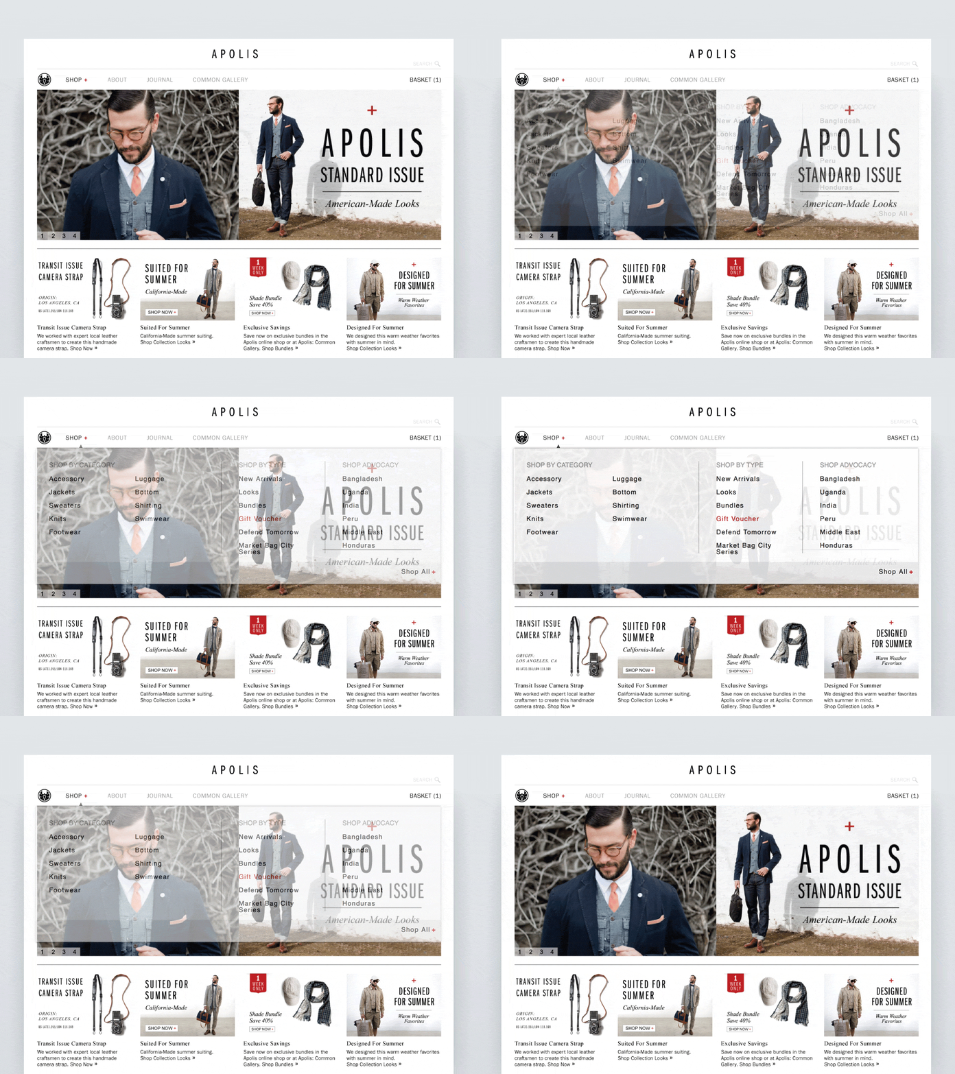
After visual consistency was initially established in Apolis’ email and social campaigns, I redesigned the home page to allow integration of each product campaign and story. I also updated the UI elements to include the Apolis brand’s chosen typeface, ITC Franklin Gothic, paired with Times New Roman for body copy. Before leaving Apolis I helped lay the groundwork strategy for a responsive redesign of the entire site, successfully launched after I left, which is the site’s current form today.

NAVIGATION
Originally the e-commerce UX met users with a splash page of shop categories. I improved the efficiency of navigation and lowered the customer bounce rate by designing a full-width dropdown, allowing users to easily jump from one category to another from anywhere within the site.

SHOPPING CART
The next UX project was a redesigned shopping cart and user checkout flow with updated UI elements to make it obvious where each user was in the process. Layout improvements were made by integrating a grid system to improve visual consistency and remove any user obstacles while navigating through the checkout process. The checkout form was streamlined from three pages down to a single page, with the whole process completed in four simple steps from basket to receipt.


TRANSACTIONAL EMAIL
In 2015 I was contracted to redesign transactional customer emails for online orders. Starting with a mobile-first approach, I developed the order receipt and shipping confirmation email design to be lean and flexible while maintaining Apolis brand with minimal images.


Editorial
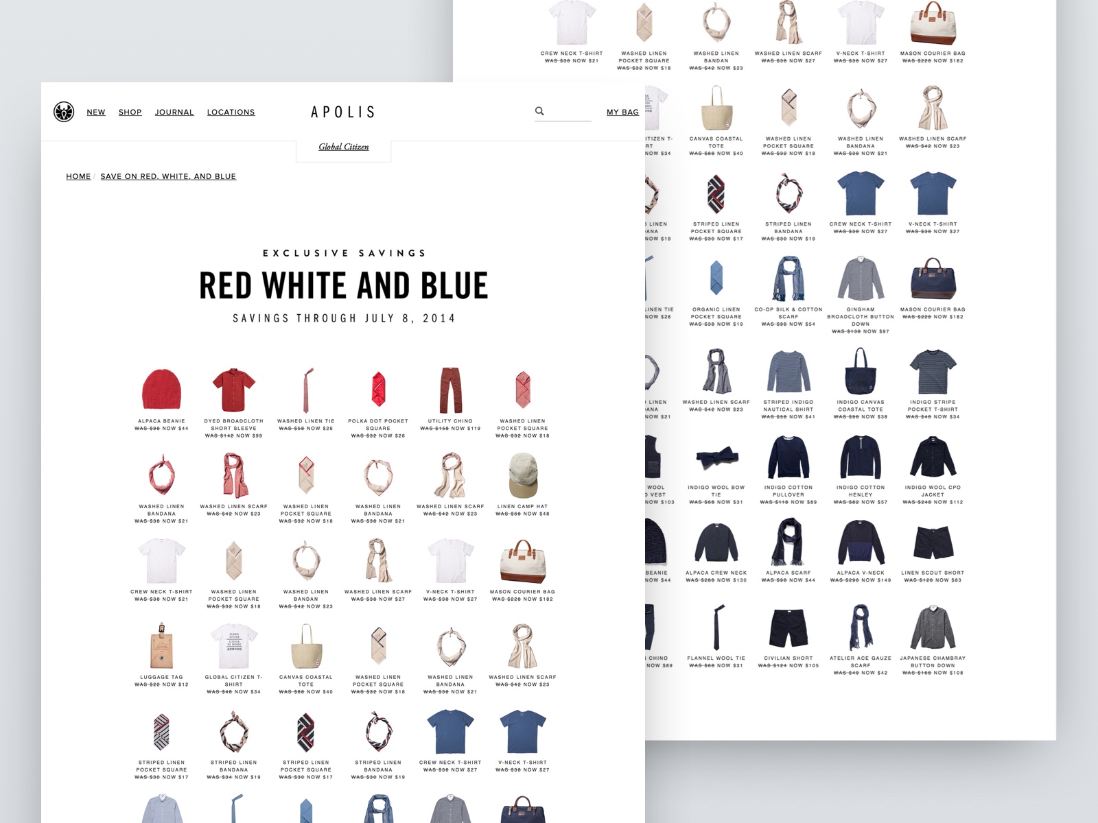
For special products, collections, and collaborations, I created unique editorial layouts to showcase the launches and provide context for the product story.


